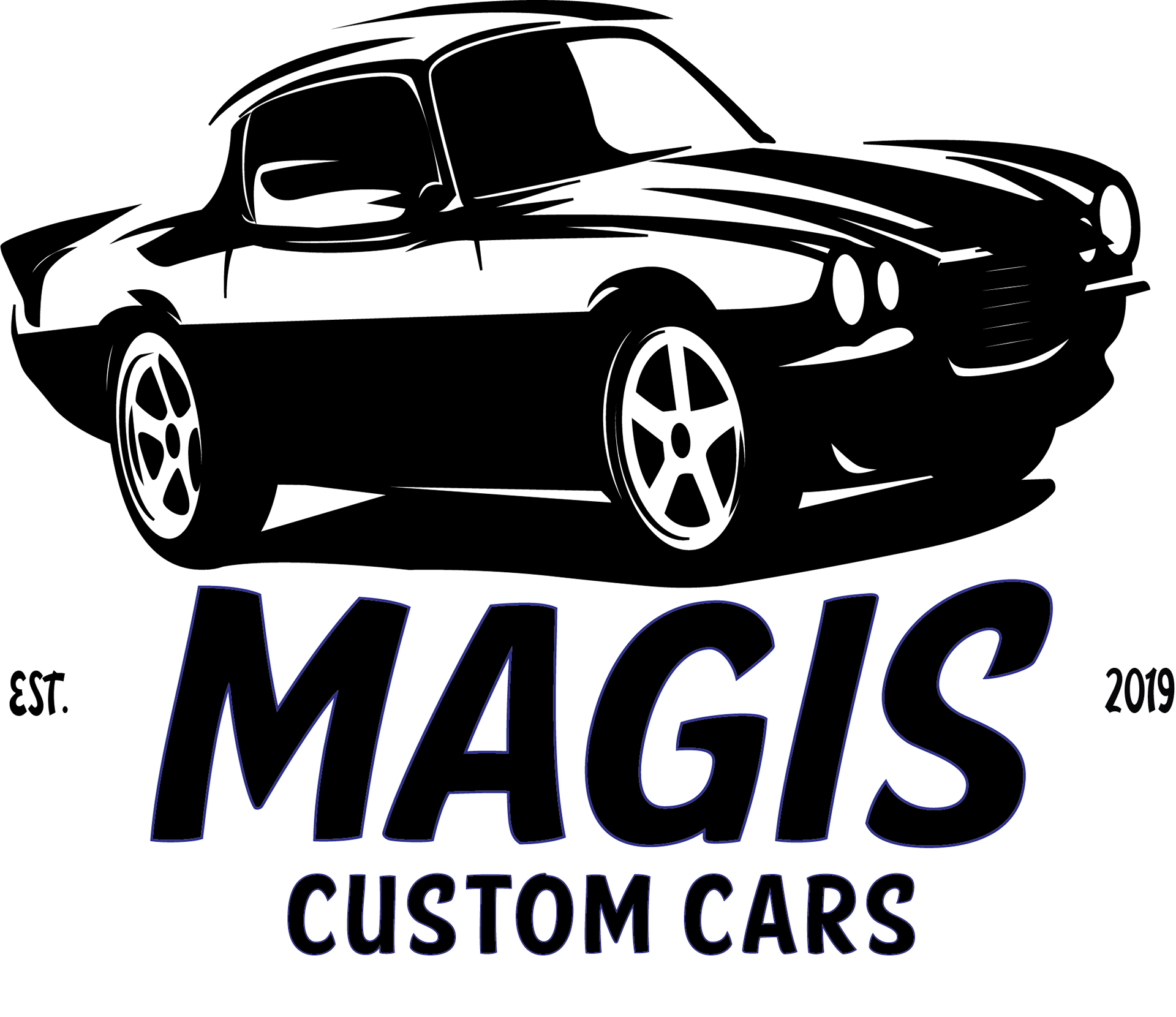
Magis Motors - Custom Cars
‘We are more than cars. We are car people, and through our love of cars, engineering, beauty and creativity; it is our passion to show our customers just what a car can truly be.’
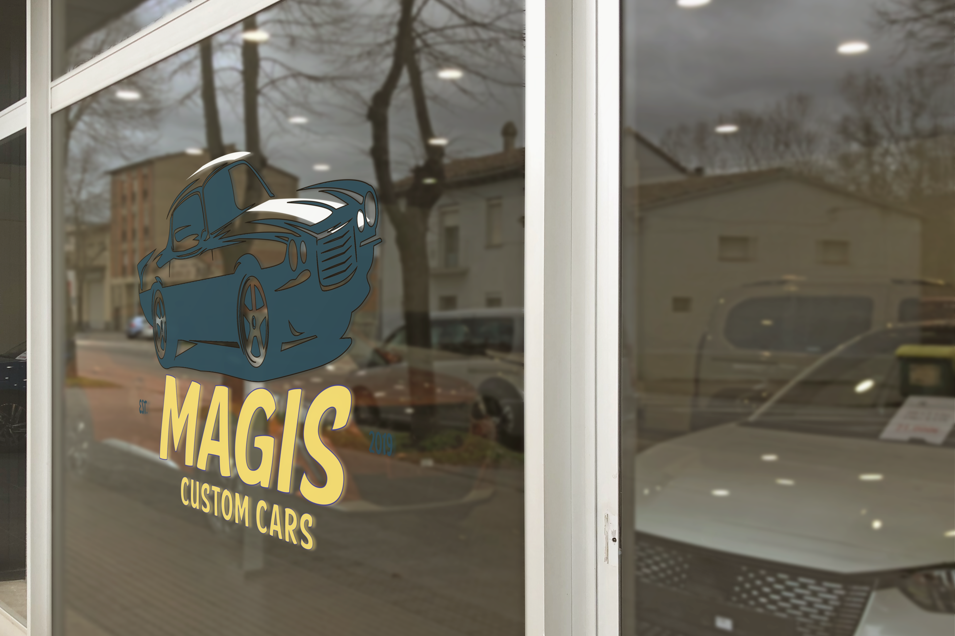
Keying in on the perfect font and colour choices were paramount on this assignment. The aim was to find something that spoke of motor sports but in a fun but professional manner. The word itself, ‘Magis’ it was felt needed to be conveyed in the font choice as well. This font is ideally named and is called ‘Speedy Casual’, and that was exactly what the intention was. From there, the colour scheme was chosen and is a modern tweak on the time of the muscle car heyday: the 1970’s. Royal Blue and a golden-hued yellow were chosen as they have a retro feel to them but also can be brought into a modern example while playing together very nicely. The car itself can be an alternate logo itself and is a custom looking car that is a mix of muscle and modern sport.
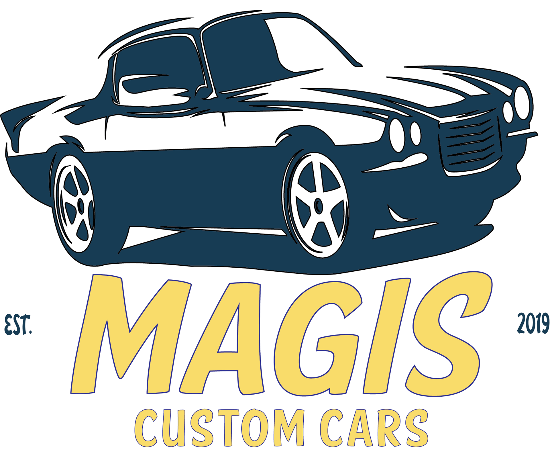
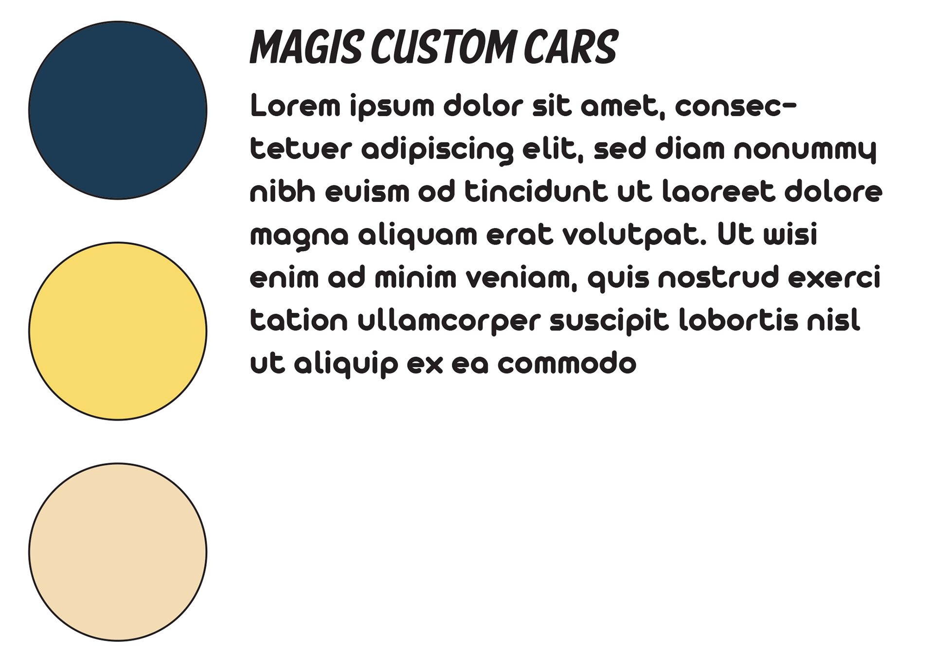
My process begins with colours first, then fonts and then I build and adjust from there. Here we have the start of what became this logo.
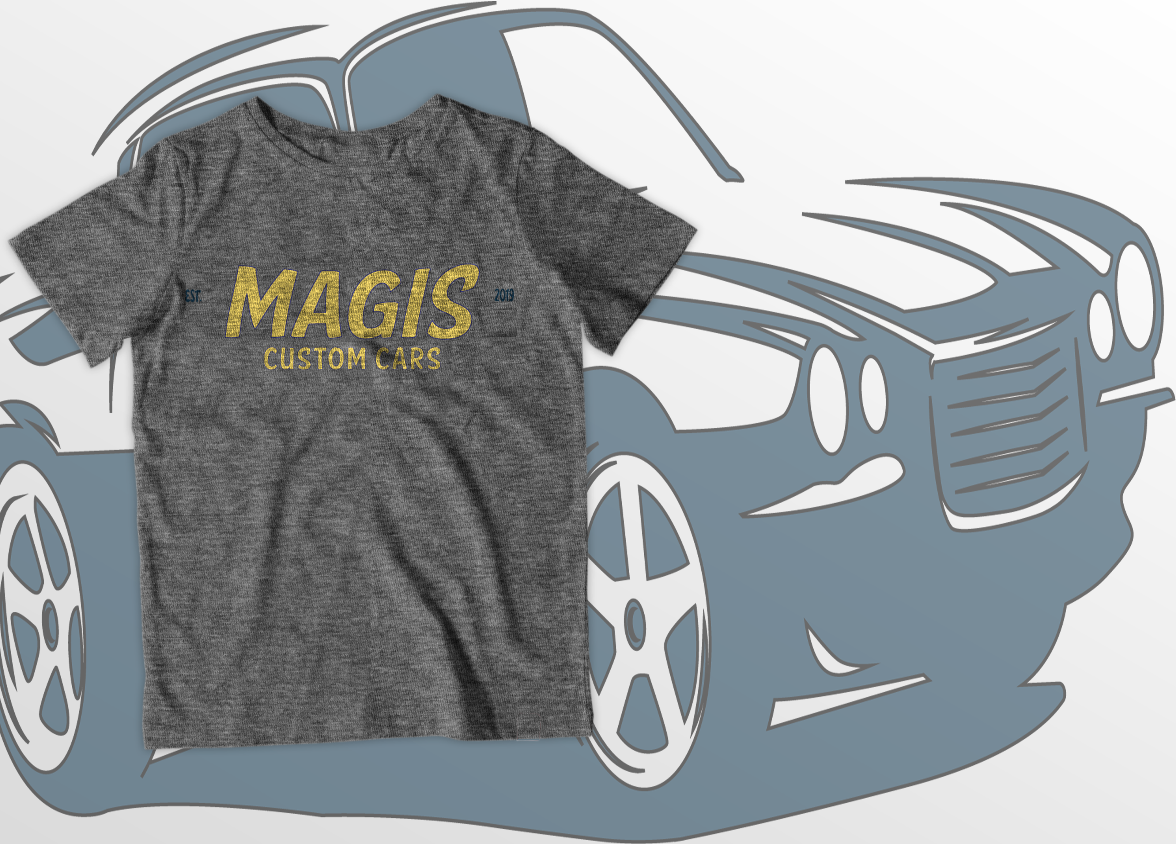
A logo should look great accross a wide array of places and mediums.
Drive good, look better
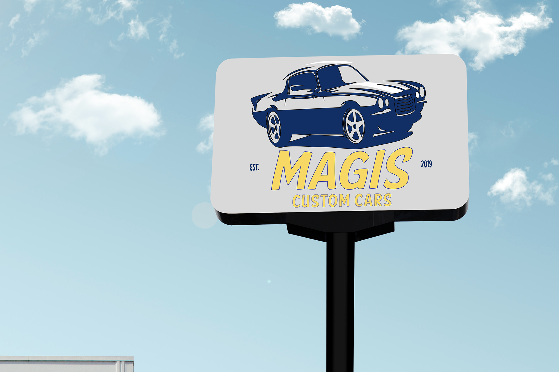
Made for the road, made for billboards

A great logo makes great merch. This was a definite must.
welcome to Magis.
Very fitting to have the Magis in motion. Having the sweet ride slide onto the name plate was an obvious and fun decision to make.