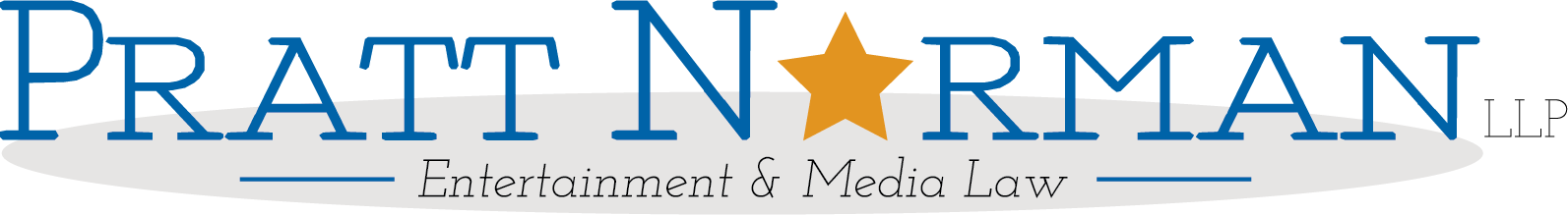
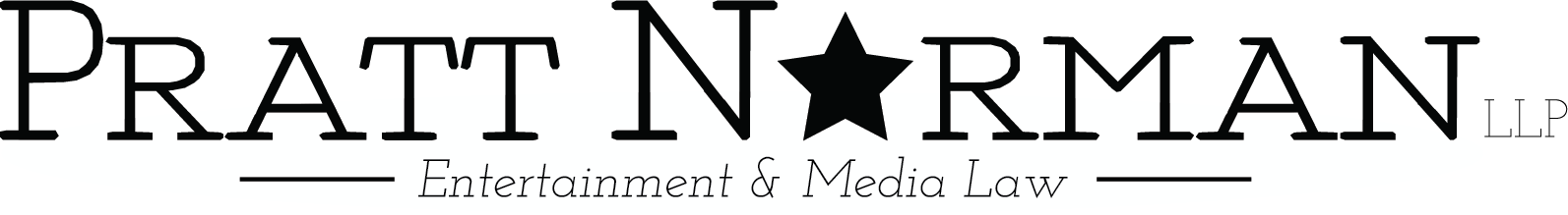
This project was about creating a logo and materials for a new law firm, Pratt Norman. PN is an entertainment law firm with a young, famous and high-end clientele. The aim was to create a look that was professional, but sleek that would stand out among the competition. Below is the logo treatment, some mock-ups and the logo in action. This work was done in Illustrator, the mock-ups in Photoshop and the animation in After Effects.
This is the main logo I created. The first steps was creating a fun colour scheme and a royal blue, platinum and orange were chosen. The slab serif font is called
'Fragmant Core Roman', not only does this font appeal to traditionalists while looking modern it is also a very versatile font and can range from thin to extra bold to cover all their typographical needs. With that, it's really the 'star' that is meant to be the focal point of the logo.
'Fragmant Core Roman', not only does this font appeal to traditionalists while looking modern it is also a very versatile font and can range from thin to extra bold to cover all their typographical needs. With that, it's really the 'star' that is meant to be the focal point of the logo.
Here we see it in its black and white iteration.
Here is the alternate version here when spatial limitations are needed. This one is also available in B&W too.

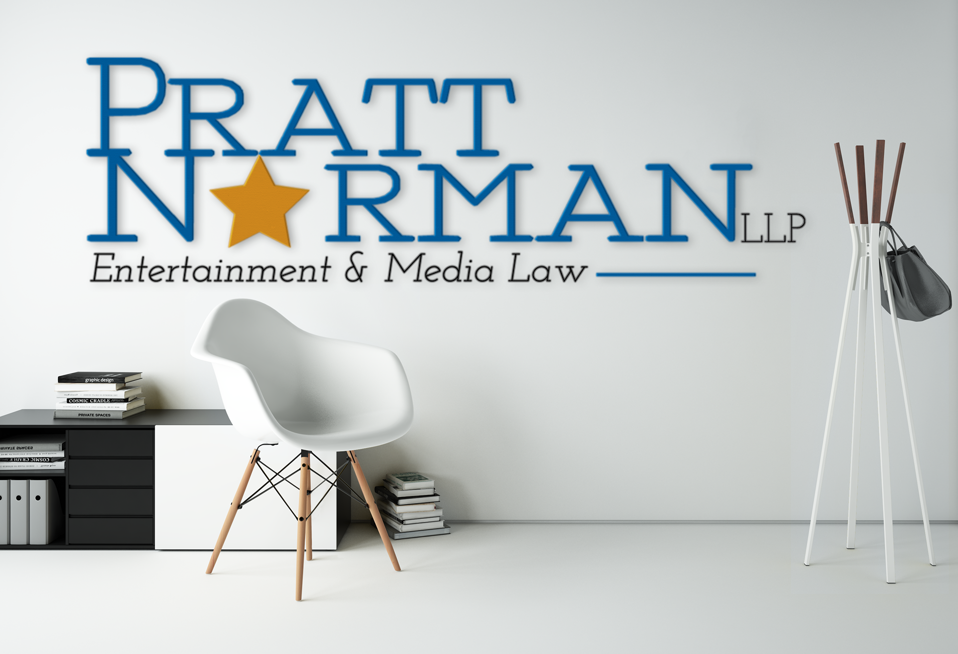
Welcome back to the office. Reflective of the cool, relaxed but professional working environment that Pratt Norman is known for.
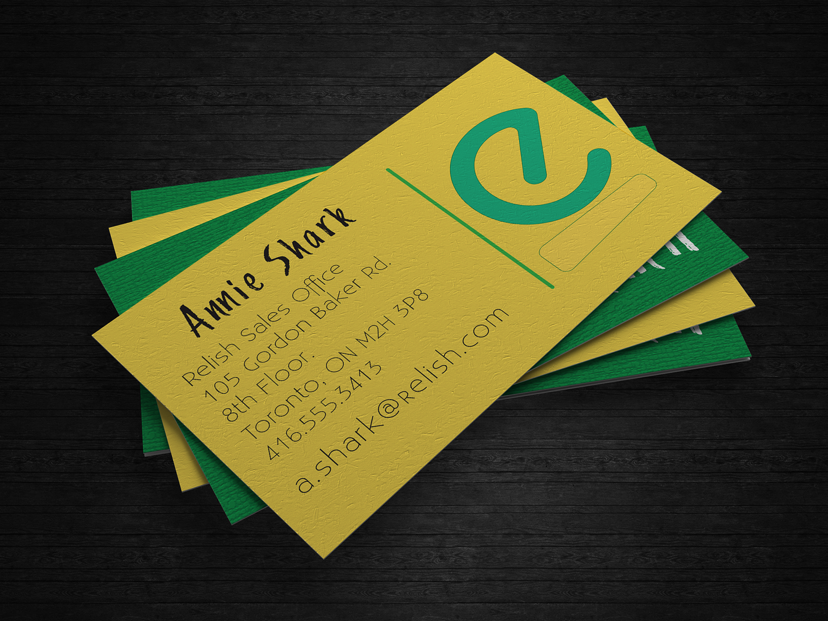
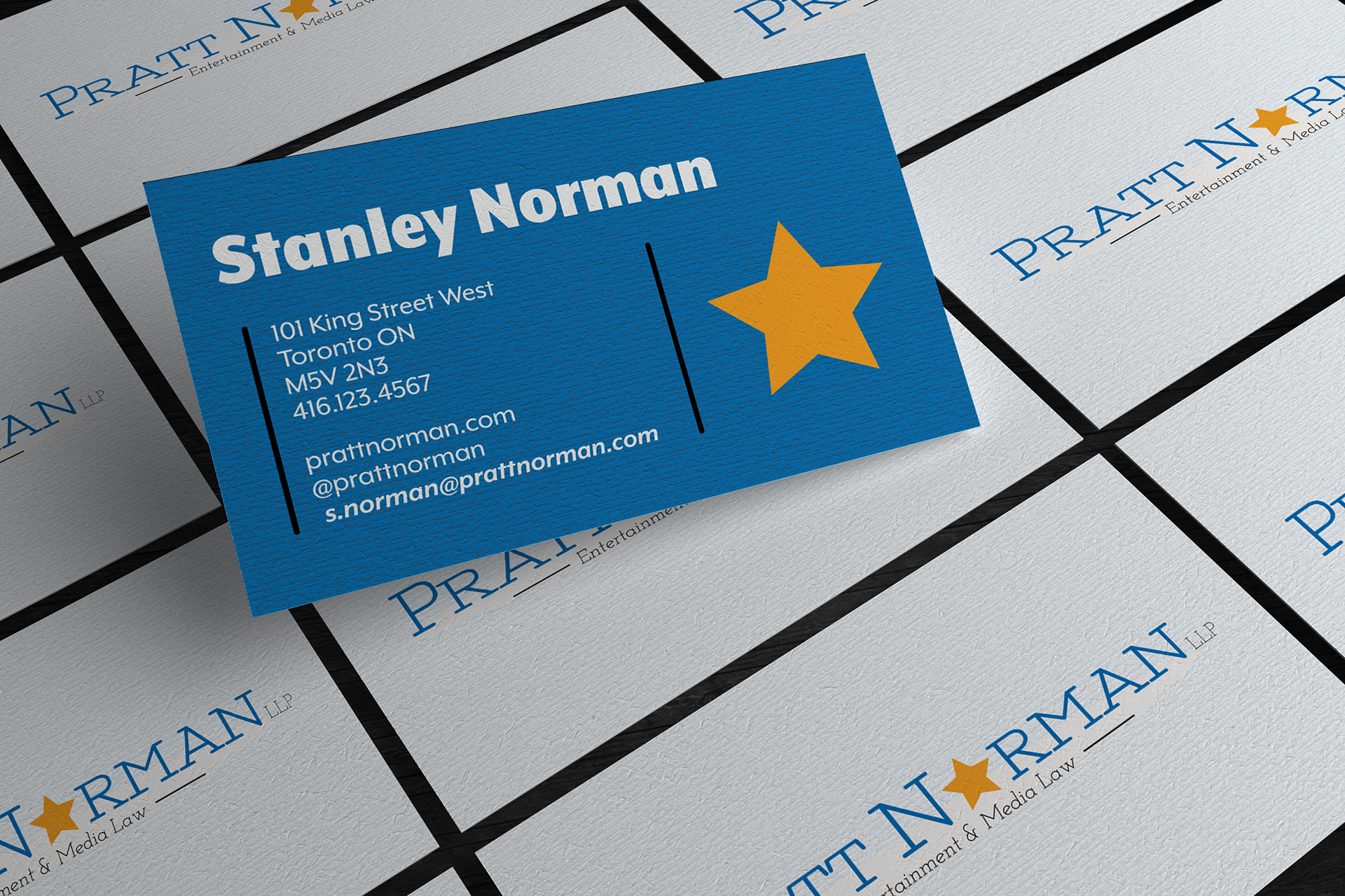
The logo on display in business card form. The colours, fonts and layout all on display on a nice thick card stock.
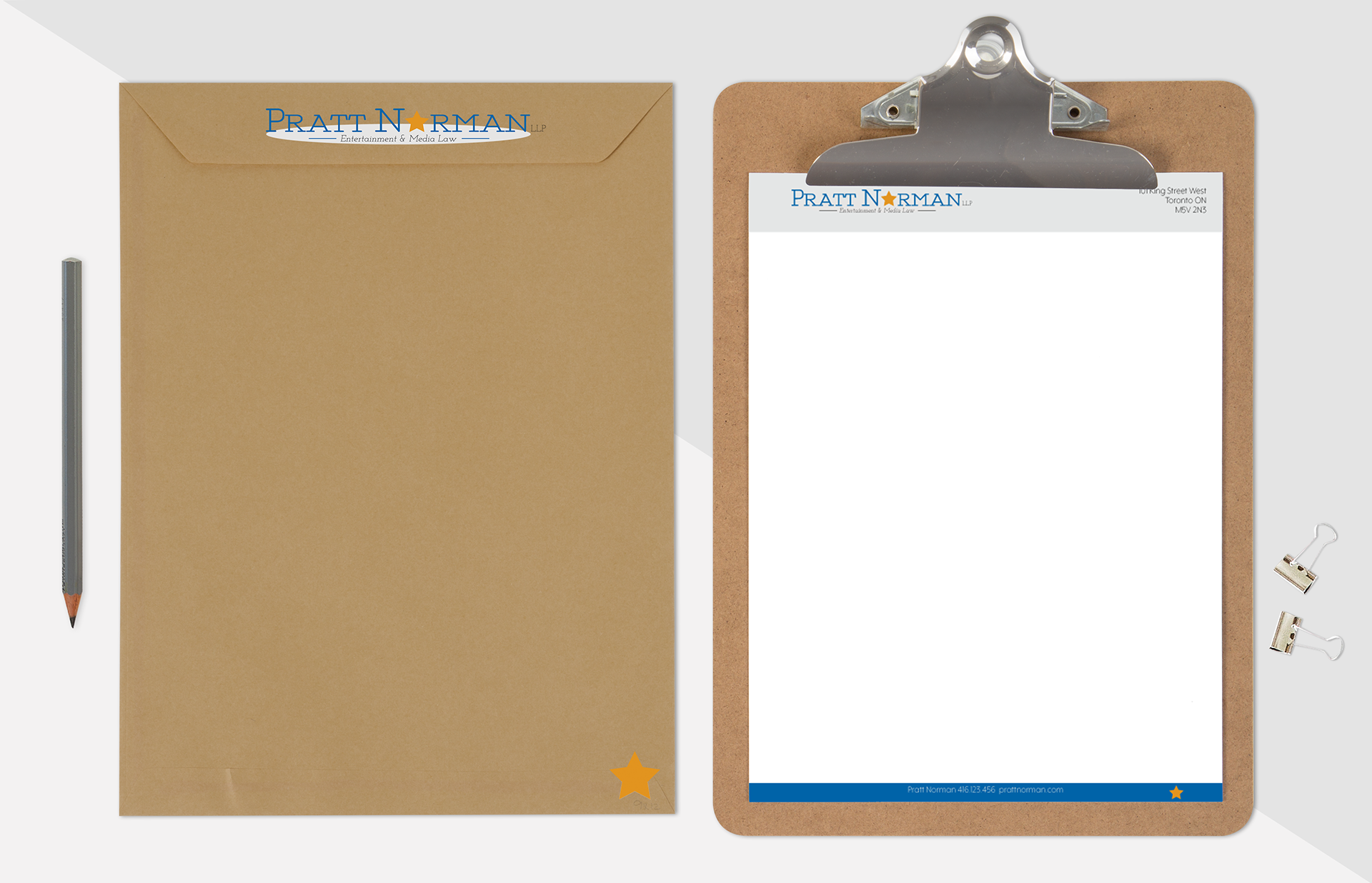
Looking great on the letterhead and stationary.
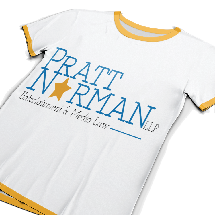
Win your case in court, and on the fashion scene with the exclusive Pratt Norman shirt.
Simple little animation here, but showcases the ability for the work I can do to be more than just a sedimentary image. It can dance too!